Disclaimer: This post is a personal effort and is not in any way advetorial for any party involved. It does not reflect the views of my current, past or future employers.
You know that amazing feeling when your network provider gives you great call rates, cheap data bundles that last, amazing network quality and awesome customer service? No? Yeah, me neither. If you are like me and most people I know, you are probably in a love-hate relationship with your network provider. It’s safe to say that all network providers are frustrating. However, some are more frustrating than others.
The question is: Can we determine which network provider is not going to be that frustrating? Based on the sort of phone I use; can I say if I am going to prefer Etisalat to Airtel?
Well, the answer is probably going to be a yes. There are several approaches out there to determine this like Polls, Customer surveys etc. I, on the other hand, decided to analyze customer’s social media. By analyzing what customers are tweeting about; we can infer, with a good amount of confidence, how good the services of a network provider are. This approach is called Sentiment Analysis. It is used to analyze sentiments in sentences (tweets in this case) and provides a negative or positive score based on the words in the tweet. Words like ‘angry’, ‘hate’, ‘annoyed’ appearing in a tweet tend to produce a negative sentiment score while words like ‘love’, ‘like’, ‘amazed’ would do the opposite. With a bit of ambition, I also analyzed emojis for their negative/positive sentiment (I was extremely proud of this!). So next time you are frustrated about your 10 GB data plan being wiped off in three hours and you would like to “port” your number to another service, you have a data-driven way of making that decision!
Using the twitteR package on R, I collected tweets relating to these service providers from Twitter between the 14th to the 25th of September. The sort of attributes gotten were: The tweet, the sort of phone used, how many retweets/favorites the tweet got etc. I then used the stringr package to clean the tweets removing punctuations, trailing and leading spaces, URLs and other stuff that don’t help our analysis. This was where most of my time was spent. Natural Language Processing is pretty challenging. I had up to 200 lines of code and over 90% of it was spent on data cleaning. In this cleaning process, I discovered that people spelt ‘mountain’ as ‘mtn’. I know this because I kept on seeing tweets like ‘mtn dew’ and ‘mtn bike’ which was pretty annoying. However, this paled in comparison to getting Glo-related tweets. You cannot imagine the number of tweets that were not about the network provider but about some guy talking about how their previous breakup upped their ‘glo up’ game. Sigh. After the tweets were squeaky clean, I scored the sentiment of each tweet using the AFINN lexicon which gives a sentiment score between -5 to 5 for several words. Finally, I created wordclouds using the wordcloud package after converting the tweets to a clean corpus using the tm and SnowballC package. The code can be found here.
I think it is important point out that Twitter is a very small sample of any network providers’ customer base. This means that what may be true for this sample might not neccessarily apply to the general population. Facebook would have been a better option but that API has been deprecated.
These are some teasers on the interesting stuff I found on Twitter:
- There is a service provider who the only guys that say positive things on average about them are guys tweeting from TweetDeck or sharing posts from Facebook.
- The service provider with the most satisfied customers is going to be a shocker.
- People are pretty much indifferent to the provider everyone thought was most liked.
- There is a network provider whose customers complain an average of 75% of the day.
- One service provider has either weird or ‘old school’ customers who don’t use emojis.
- iPhone users are generally not positive towards any service provider.
- One service provider has customers who would rather tweet when they have positive things to say about their service provider rather than slander them (I hope to have customers like this someday).
Let’s break it down to each service provider and talk about the interesting things we found out about them. If you want to have a closer look at the visualizations I’ll be using, that can be found here.
MTN
With close to 40% market share by number of subscribers (based on data published by the NCC), these are the big guys in the Nigerian Telecommunication Industry. The question is, are they living up to the name? Let’s look at a dashboard I created to visualize how well they are doing based on tweets about them.
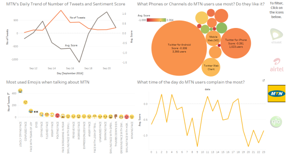
With an average sentiment score of -0.24 on Twitter, well, I don’t think they are doing that great.
- The first chart is a trend chart. The orange line shows the number of tweets tweeted about MTN every day for this time period while the grey line is the average score over the same time period. Nothing really interesting here except that on the 17th of September, MTN users were more riled up than usual.
- The second one is a bubble chart and it’s looking interesting. The colors of the bubbles range from red which is the most negative sentiment to green being the most positive. The legend for the color scale are at the top left of the chart. The size of the bubble is determined by the number of tweets from that source. It is immediately clear that almost no one on Twitter likes MTN.
- Those little green bubbles are not from phones. Those are tweets from TweetDeck and people sharing stuff from Facebook. This might mean they have good data services. Some bubbles are really small and would make the chart look cluttered if we tried to label them all. It might be a good idea to take a look for yourself by clicking the link above.
- The third chart shows emojis on the horizontal axis and how frequently they are used on the vertical axis. They are mostly negative emojis which again re-emphasizes that customers on Twitter generally do not really like them or their services.
- The fourth shows the average score for every hour across all the days in this time period. If you look closely, you would see that there only 6 hours on an average day where MTN users say stuff that are positive. This means that MTN users are the guys who spend 75% of the day complaining about their services or saying negative things about them. That’s a lot of time and energy spent by the customers being angry on Twitter.
Let’s look at a wordcloud showing the key words that appear in the same tweet as MTN over this time period.
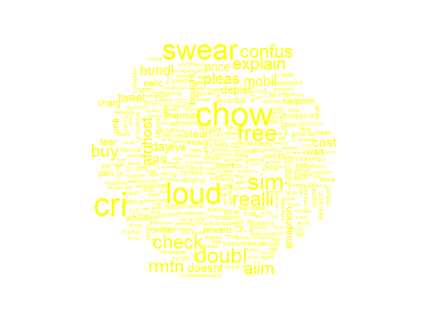
The size of the word shows how often they were used when talking about MTN. We can see words like swear, confus(e), explain, cri, loud, free and the rest. These words are mostly negative words. It’s safe to say that this service provider is not very much liked on Twitter.
If you are wondering why some words don’t look complete, you can read about stemming here.
Let’s take a look at the next service provider.
Etisalat
The up and coming fresh guys of the Telecoms’ space. Although they might have the smallest market share in terms of number of subscribers, they have been growing exponentially over the past few years. Have they impressed their customers so far with their amazingness and awesomeness? Let’s see about that.

I was pretty shocked when I saw this. With an average sentiment score -0.04, it seems that customers are generally indifferent towards them only showing slight negativity. This was a bit shocking because they *seem* to be the guys everyone likes. The number of tweets on Etisalat seems consistent no matter how bad or good the customers feel about their services on a particular day. The Android guys don’t like them. The iPhone guys like them even less. The Blackberry and iPad users seem to like them a lot though. The other green dots are mostly from Twitter for web clients. Of all the popular emojis for Etisalat, only three are positive. Etisalat Customers seem to complain only early in the morning before 8am (UTC+1.00) and then their sentiment dances around the zero line mostly for the rest of the day. This, again, validates that customers are somewhat indifferent to their services.
Let’s take a look at their wordcloud.

It seems customers spend a lot of time comparing them to competitors. By eyeballing it, there are no (mostly used) words that stand out as definitely positive or negative.
Glo
Coming in second place in market share and being an indigenous company, they are a company Nigeria should be proud of. Let’s see what their customers on Twitter think about them.

Either the Glo users are either the older demographic of Twitter who aren’t really into using emojis to express themselves, generally do not use emoji enabled phones or they are pretty weird people. With an average sentiment score -0.19, they are also a Telco that is not well liked. Surprisingly, this is the only Telco that the iPhone guys do not hate (Note I did not say ‘like’, the average sentiment is 0.07 which is pretty apathetic). The rest of the major phone demographics do not seem to like them that much. It also seems that Glo users are the guys who tweet most when they are happy with their services. You can see that some of the spikes in number of tweets in a day also correlate with spikes in the average sentiment score. Over the day, the cycle of the average sentiment on Twitter is fairly consistent after they complain bitterly by 6 am (UTC+1:00).
Let’s look at their wordcloud.

We can see words like bad, smile (which might be referring to the internet services firm), browse, sleep. Not a lot of words really stand out in their sentiment.
AIRTEL
With over 31 million users in Nigeria and a lot of international presence in Asia and other places in Africa, let’s see how well they are liked.
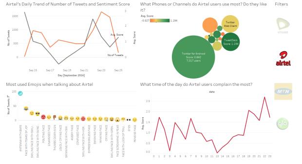
Well, they look like they are liked quite a lot. In fact, their average sentiment score is 0.63. The highest sentiment score achieved by any Telco and the only guys with a positive sentiment score. This places them as the most liked service provider. There was only one day in this time period where their average sentiment score was negative. The only major phone demographic that is not crazy about them are the iPhone guys. The first negative emoji used for Airtel came in 5th position and interestingly, the most used emoji for tweets with Airtel in them is an Antenna with full bars. Generally, Airtel customers do not complain a lot about their services. In fact, there seems to be no hour of the day that, on average, with a negative sentiment score.
Now let’s take a look at their wordcloud showing the most frequent words used in tweets involving Airtel.

Nothing particularly stands out as negative (only if you look very closely). We see words like free, unlimit(ed), care, offer, custom(er). These are generally positive words and supports the Airtel love!
Based on all of this, here are my conclusions.
- If you are an iPhone user, you are doomed. Just kidding, you’d probably do okay with Glo.
- It seems Etisalat’s BIS plans and service are doing great in the BlackBerry space. Consider getting thier SIMs the next time you want to get a make-shift smartphone. No shade.
- Pretty much every other phone user is good with Airtel.
A few disclaimers:
- This is a very, very short time period of less than two weeks. I would keep on collecting data on this and make inferences at the end of the year (maybe).
- I tried my best to control for promotional tweets (I won’t bore you with the details here, the code has lots of comments that can guide you through that process) but some still pass the filter test and there is a very small possibility that these tweets could skew the analysis.
- Some of these companies are not just in Nigeria meaning that some tweets are from places like Uganda, South Africa, India etc. This means that this analysis is not confined to the sentiment of Nigerians alone.
- This analysis is from twitter and constitutes a relatively small part of the customer base of a network provider. The twitter guys are mostly from the millenial generation. Although this has been the target market, especially for data related services, what may be true for this sample may not necessarily apply to the population/whole customer base.
Going forward, I would like to answer why MTN, though not really well liked, still has a lot of customers (like me). This would mean answering questions like does sentiment necessarily show customer preference? I would probably segment this analysis a bit further to analyze sentiment for call quality, data services etc. It would also be nice to add Smile, Spectranet and the likes to this analysis.
Feel free to add a comment! Thanks for reading!

Rosebud this is really interesting and insightful.
LikeLike
Really interesting and insightful, just shows how much you can get from data mining, and this is just for 2 weeks and from Twitter only.
Would love to read the update at the end of the year 🙂
LikeLike
Awesome Stuff!
LikeLike
This is really beautiful. One thing though, the images in the post are small. Create a static web page with bigger images maybe?
LikeLike
Hi Ope!
Thank you! There is a static webpage. The link is referenced in the article. Here it is: https://public.tableau.com/profile/rosebud.anwuri#!/vizhome/SentimentAnalysis-Twitter/SentimentAnalysis
LikeLike
Amazing stuff
LikeLike
This is dope
LikeLike
This is informative post for me..
I added your website into my bookmarks.
🙂 Looking forward for upcoming updates!
Regards,
James
LikeLike